UNIC LOGO
Logo – long version
Use this version for external audiences where the full name ensures our identity. Also use it when communication has a more formal approach.
Logo – short version
Use this version for internal communication. Also use it as a primary signature on our central buildings.
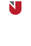
LOGO CONSTRUCTION
The masterbrand comprises our wordmark and the Crest in a consistent relationship. In order to maintain maximum visual impact and accommodate varying space limitations, our wordmark has several configurations: 1-line and 2-line for crest on top and 1-line and 2-line for crest on left.
Logos should not be redrawn, recoloured, edited or altered in any way.
MONOCHROME VERSIONS
Monochromatic logos are available only for black-and-white and monochromatic scenarios. However, the UNIC logo should only be used in its monochromatic versions when colour printing or multi-colouring is not available in either print or digital formats.

COLOURS
Our logo is our most valuable asset and colour is the most recognisable aspect of our brand identity. Colours were selected to reflect our bold, global community. Using colour in a distinctive and appropriate manner is one of the easiest ways to ensure a cohesive UNIC image or visual story.
CLEAR SPACE AND MINIMUM SIZES
To maintain its impact and immediate visual recognition, no text, graphic element, or edge should interfere with logo.
RULES
The minimum amount of clear space required around the Logo is equal to the width of the triangle in the crest. This clear space is a minimum and should be increased where possible. The clear space must be maintained on all sides of the logo.
MINIMUM SIZES
To maintain full legibility and visual recognition, never reproduce the logo at heights (crest) smaller than 7mm tall for print and 25 pixels tall for digital.
BACKGROUND CONTROL
To allow proper readability and maximum visual impact, a white safety area is set around the crest. The wordmark can be UNIC gray or white depending on the darkness of the background.

SCHOOL LOGOS
School lockups may use the master logo long version, or the short version for internal communication.
Use the width of the triangle in the crest as a measuring tool to help.


ACADEMIC DEPARTMENTS
Academic Department lockups use the master long version of the logo.
Use the width of the triangle in the crest as a measuring tool to help.

LOCATIONS
Location lockups use the master short version of the logo.
Use the width of the triangle in the crest as a measuring tool to help.

ADMINISTRATIVE OFFICES
Administrative Office lockups use the master short version of the logo.
Use the width of the triangle in the crest as a measuring tool to help.


PARTNERSHIPS AND AFFILIATIONS
Our logo may need to be applied to third-party material and in situations where UNIC has minimal control or it might need to appear next to a partner logo. Our identity elements must be featured in the right way, without placing unfair restrictions on the other party.
- Try to use the UNIC primary long logo version (horizontal configuration) whenever possible. This is the preferred use of our logo.
- Provide clear guidance to the third party or the agency involved, regarding the correct use of the logo and its presentation.


MISUSE
Poor use of the UNIC Logo makes us look inconsistent and unprofessional.
When using the UNIC Logo, the following rules should be adhered to at all times.
