ADVERTISING
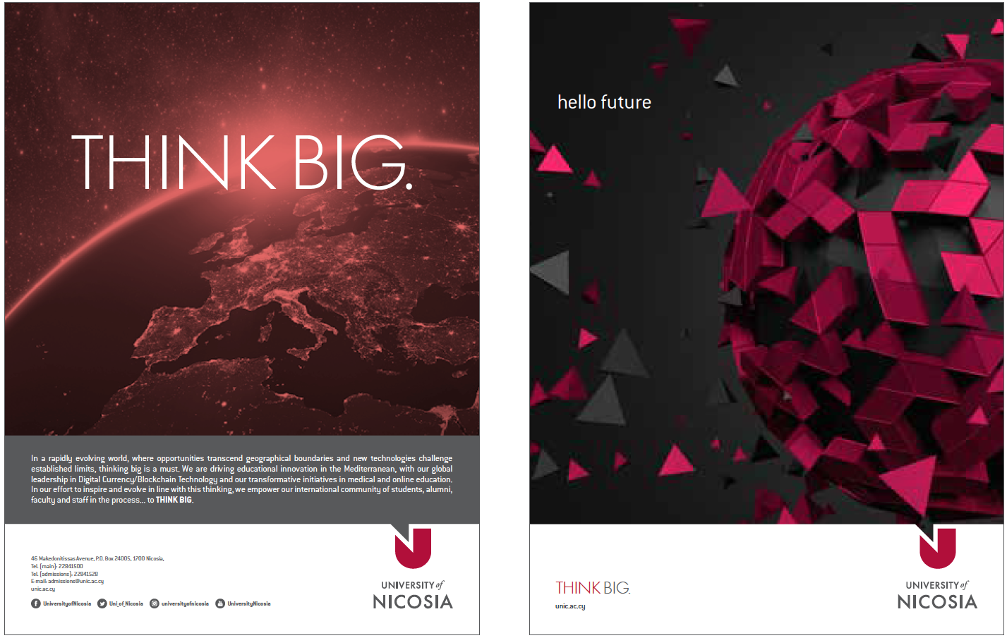
Advertising is an essential part of any brand’s communication. Therefore, ads should maintain a consistent look and feel with all other communication touch-points. This ensures that the mission and value of the UNIC brand is presented in an accurate and fascinating way.
The visual presentation is more than simply design; it is a reflection of what UNIC represents. Consistency in the use of the visual identity creates recognisability among the University’s various audiences. The UNIC brand identity should always be positive and reflect the University’s vision, differentiation, and value.
THE UNIC DEVICE
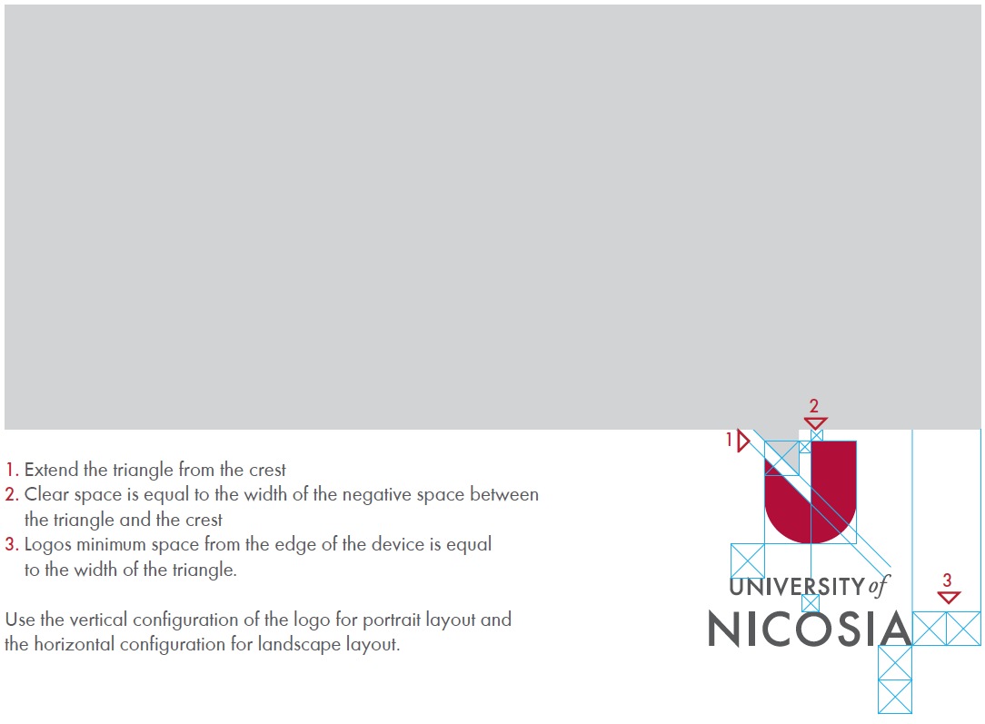
The UNIC device is a unique, flexible graphic element we use to help differentiate UNIC material and present information in a clear and consistent way. It’s a very important part of our visual identity and features on most of our printed materials.
The device is derived from our logo and it is used to express, tell a story, and show the University’s vision and values.
PRINT / SUGGESTED EXAMPLES
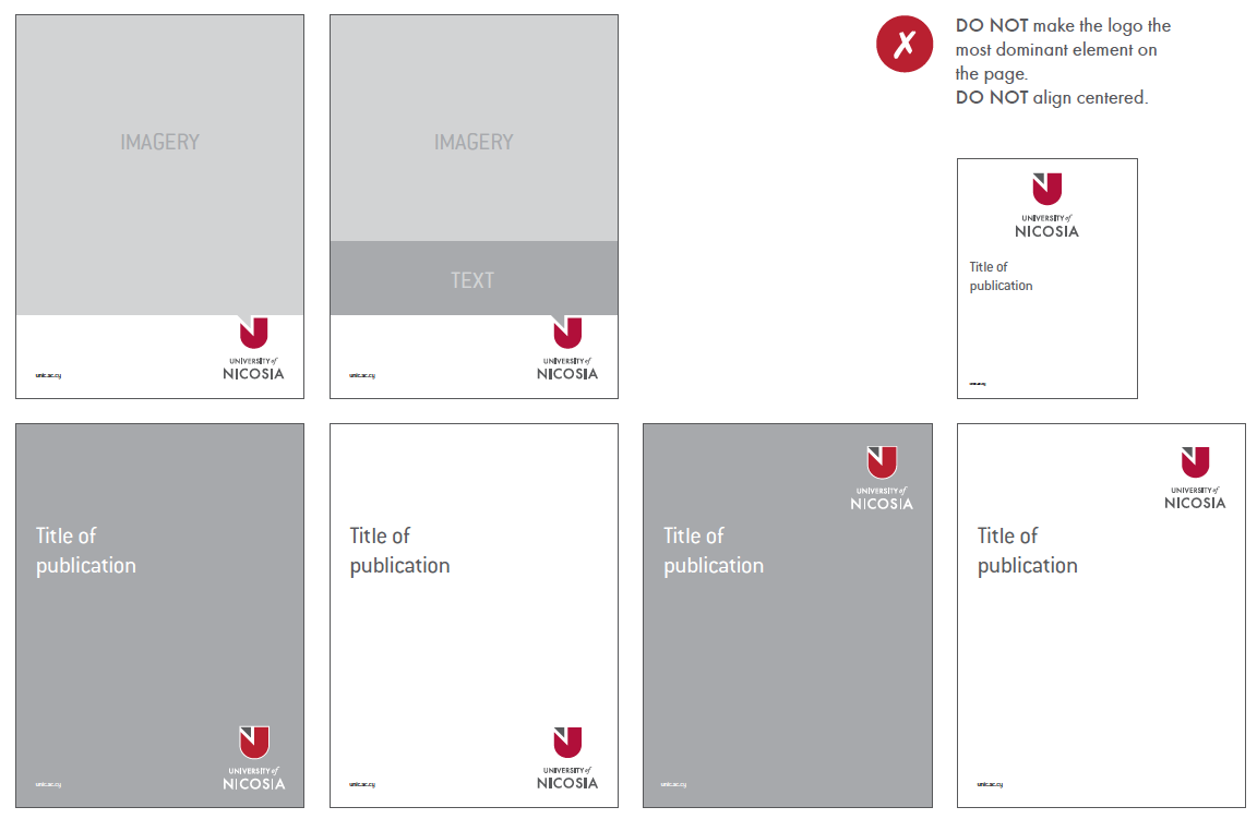
Try not to place elements too close to the logo. It is recommended to use top/bottom, left/right positioning to communicate hierarchy or organisational structure.
It is suggested to use the logo in colour, with plenty of clear space around it. Rather than centered, the logo aligns nicely when anchored into a corner.
In cases where the background is too busy/dark, the logo with a white wordmark can be used.
LOGO PLACEMENT
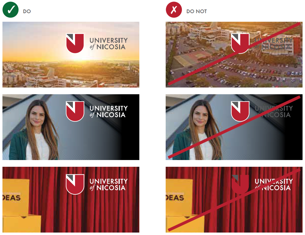
For a maximum visual impact, we do prefer to place our logo on a white background but if that is not manageable do follow the rules:
DO use the logo over backgrounds that allow the logo to be read clearly.
DO NOT use the logo over a busy background image.
DO use the white wordmark logo over dark backgrounds.
DO NOT use the logo with a UNIC gray wordmark on dark backgrounds where there isn’t enough contrast for it to stand out.
DO use the logo’s safety area on photographic backgrounds.
DO NOT allow the background to show through the crest by removing safety area.
ONLINE
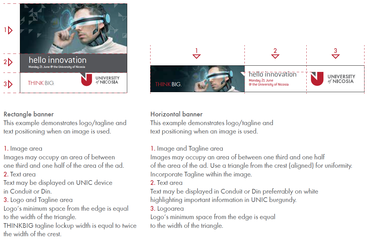
Online advertising plays a major role in today’s communication. It’s important to communicate clearly and consistently across various web environments while retaining a strong and consistent UNIC brand impression.
VIDEO
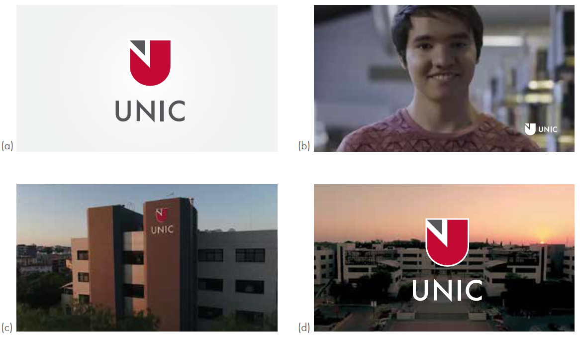
The logo (short version/vertical) must appear on initial view, meaning the logo should be included as part of the first shot, prior to any other titles or graphics. (a)
The logo may appear on the second shot at the lower right or left part if necessary. (b)
The logo may be incorporated into the video as long as readability and other guidelines are maintained. (c)
The logo must appear again as the last shot of the video, following any production information or credits. (d)
THE TRIANGLE PATTERN
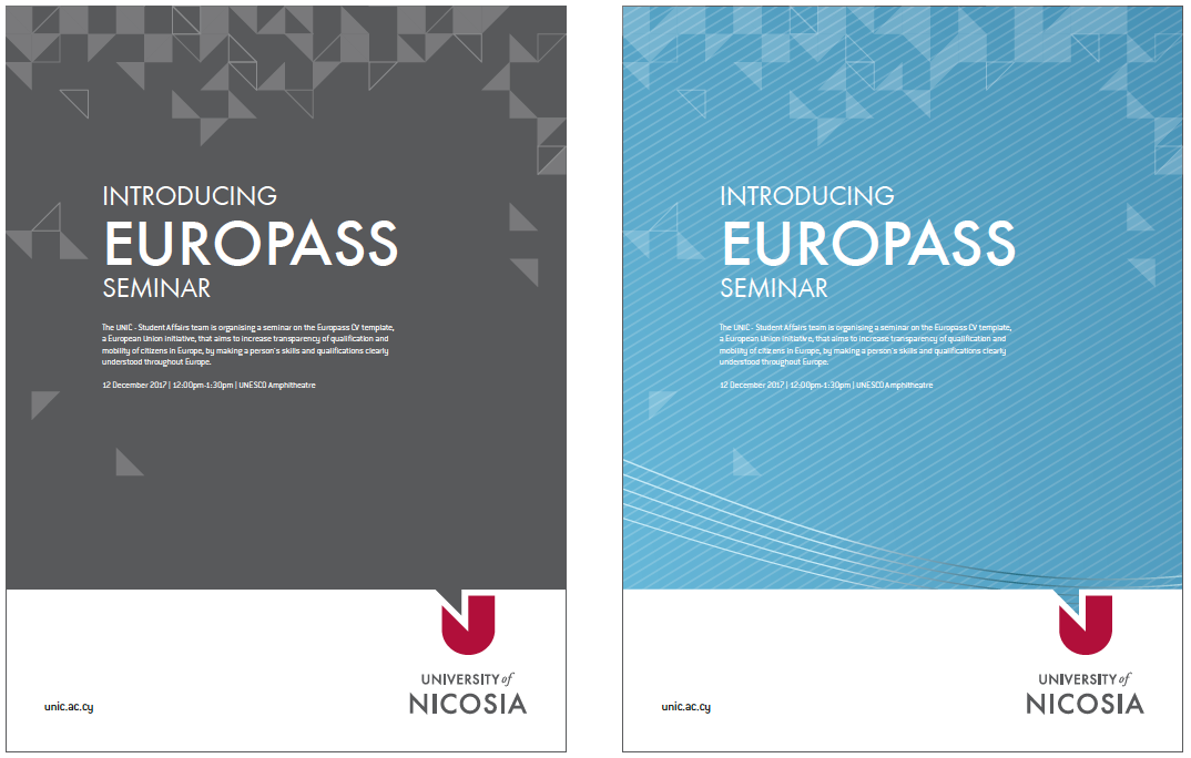
The use of our pattern empowers the brand. Use it on solid/plain backgrounds along with typography (preferably Futura) or on imagery, in order to present a differentiated UNIC visual.
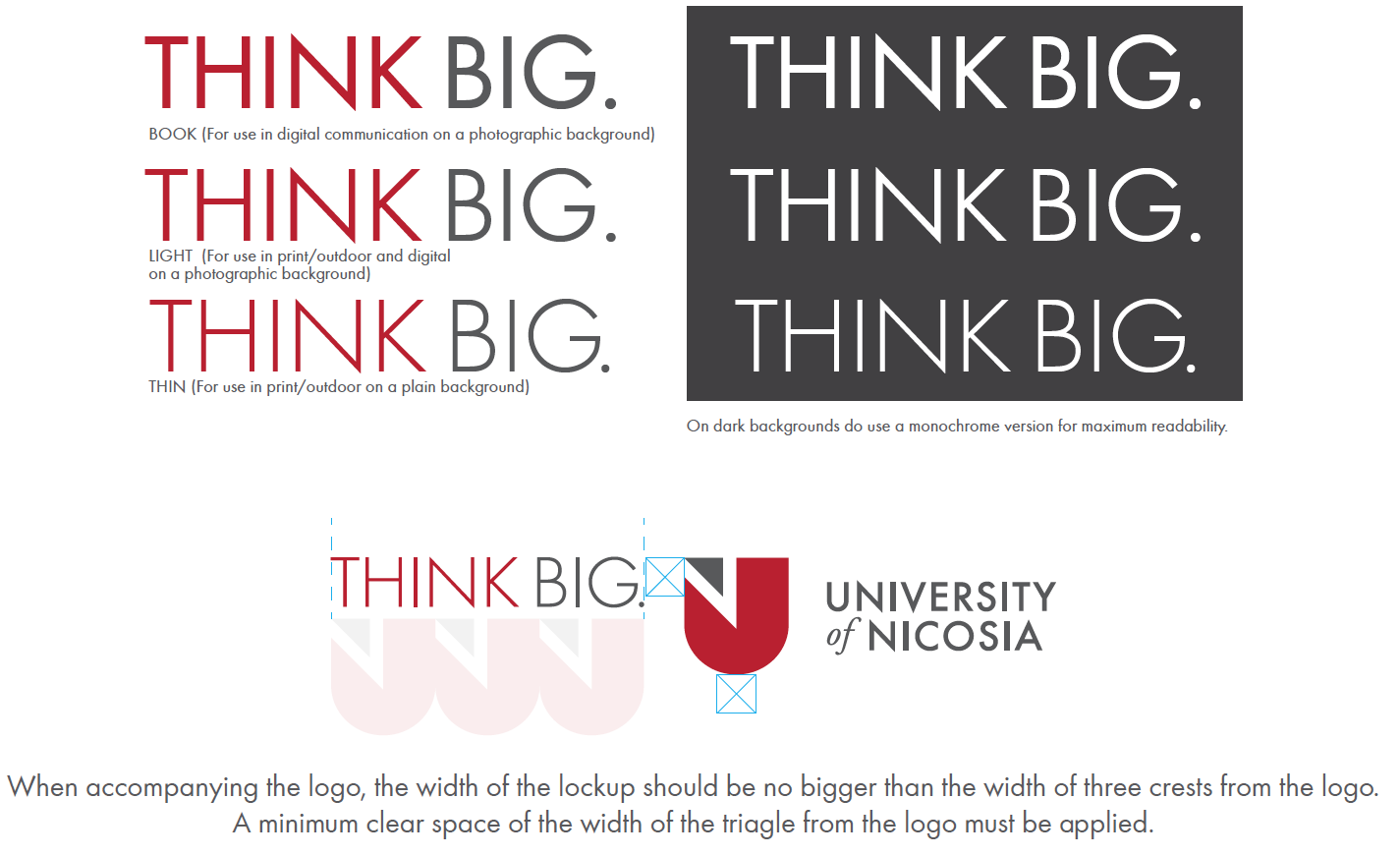
THINK BIG.
A phrase with vision. The THINK BIG. lockup should lead our communication alongside our logo.
There are three versions – light, medium and bold, all of which use the brand’s primary colours – UNIC gray, burgundy and white.
